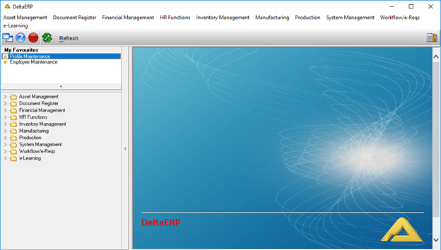
Main Menu
The DeltaERP Main Menu is the user’s navigation page to all the different modules and applications. All the module options can be found on the top of the screen or on the left-side in an easy tree view format. The 'My Favourites' section is customizable by right clicking on an application in the menu on the left and selecting 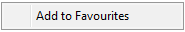 . The same process can be followed to remove an application from the 'My Favourites' section and selecting the
 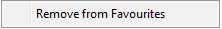 button.
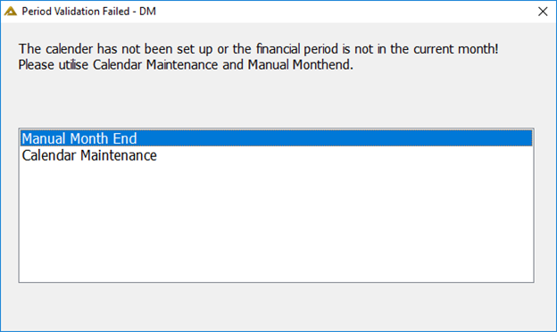
Users will not be allowed to log into DeltaERP when month end did not roll over for whatever reason. Once all DeltaERP connections are closed the Month End will run. Should connections not be closed in time the system will automatically close all connections in order to complete the month end roll-over.
Interpretation
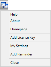
Help Option: Opens the help files
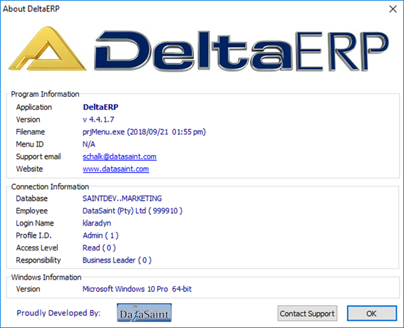
About Option: Opens the about screen:
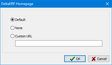
Homepage Option: Allows you to customize your homepage:
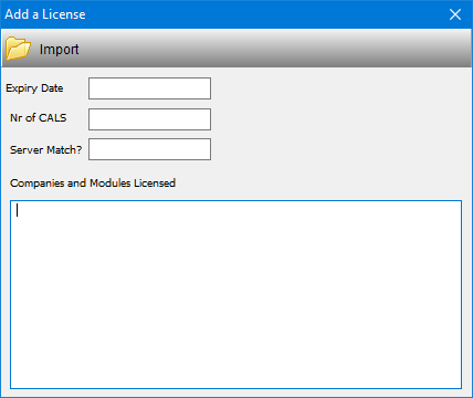
Add License Key option: Allows you to import license keys for the software:
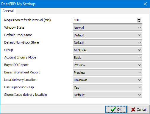
My Settings Option: Allows you to select various settings for your DeltaERP software:
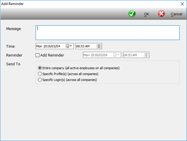
Add Reminder Option: This allows the system administrator to send a simple message with an option to remind beforehand at a certain date and time to the entire company or specific profiles or login users. Only one message can be sent at a time.
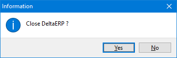
Close Option: Will close the entire main menu and any open applications.
 - Opens the help files.
 - If the user has the job of approving requisitions, this button will turn red when a requisition is awaiting approval.
 - Reloads the menu.
 - This means you have an unread newsletter which is accessible through your menu.
Once you have opened the newsletter the icon will change to a read status:
 - The newsletters you have access to are set up according to your login user module access.
To access existing newsletters, click on the unread/read icon to open:
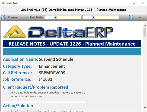
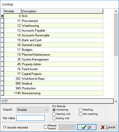
Newsletters can be selected either by searching for the module you wish to view:
Or by selecting the publish date.
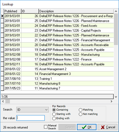
You can also scroll to previous and next newsletters using the buttons.
 or
or 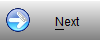
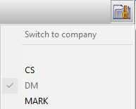 - This option allows the user to change the logged in company if more than one is available.
The bottom status bar:
• Server Name
• Database Name
• Company Code
• User Name
• Current Financial Period
• System Date
• Selected Language
• Responsibility Description. The highest assigned responsibility will be shown.
When you have no date of birth loaded on the system you will be prompted with your next log in to enter your date of birth:
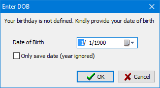
This will update the employee master via system defined credentials. When a user logs in on their birthday, a happy birthday message will be displayed.
Applications
Common Features
Using Pickers
Most applications have the option to select information from a picker.
When the user selects the picker button a look up screen will open. Scroll down the information in the look up screen until the correct option is located. Select the  button to input the option selected or double click on the chosen line.
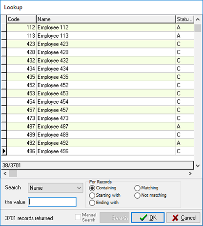
Alternatively, for a faster method of finding information using the look up screen, the user can select the search criteria:
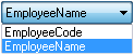
• Use the drop down arrow to select whether to search by name or code.
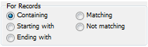
•Use the next drop down arrow to search for results: starting with, matching, containing, ending with, not matching.
•Then enter the value the search criteria must adhere to.
•The results will appear under the look up grid.
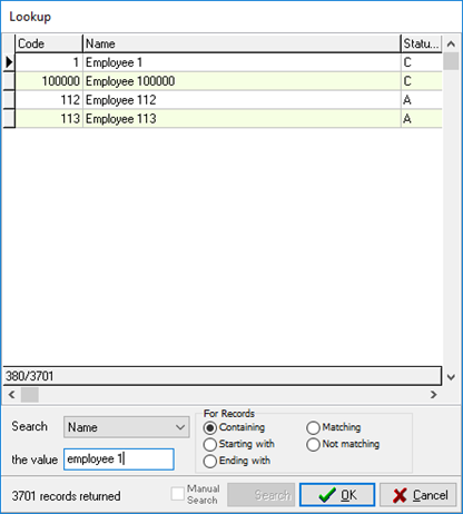
Select  to confirm the selection.
Pickers may also be used for period selection criteria.
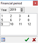
Select the picker next to the period field and use the up and down arrows to select the year. Click on the month and then the green check mark to select.
The calendar button, on the bottom left, places the selection back on the current period.
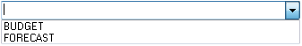
Drop down arrows
Drop down arrows are another form of supplying a list to the user to select from. Click on the drop down arrow and select the appropriate option.
Up and Down Arrows
Up and down arrows allow the user to move up the option levels when the 'Up' arrow is selected and down the option levels when the 'Down' arrow is selected.
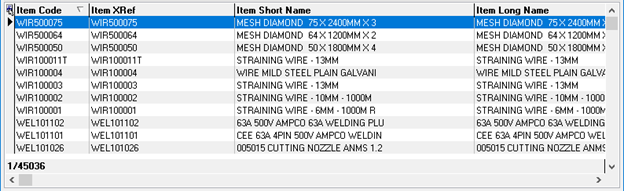
Grid Options
Sorting the information
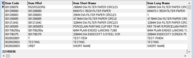
The user can sort the information in the grid according to a column heading by clicking on the columns heading. An arrow ( ) will appear in the columns heading to show that the information is sorted according to that column's information.
The arrow pointing up () sorts the information from beginning to end, click for a second time on the column heading and the arrow will point down ( ), this sorts the information from end to beginning.
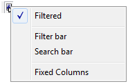
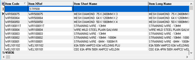
Filter and Search Bar
The grid also allows the user a filter and search bar option. In the top left corner is the filter option, select this to view the options.
The filter bar option allows the user to enter filter criteria for a column. Enter the criteria above the required column and only the results pertaining to that criteria will show in the grid. To remove the filter bar select the button in the top left corner and toggle off the filter bar option or click on the green item to the left of the filter bar.
The search option allows the user to search for specific results within the grid using the search field. The field is used in the same way as the filter bar.